Overview
The application process for a university is a critical part to their business model. The online application acts as an entry point to the university and is a way to leave a good impression on the student. Deciding to apply to the university is a big decision for students, who are often anxious and overwhelmed with the process. It was important to me to be able to simplify this process and make it an easy, step-by-step, and intuitive flow.
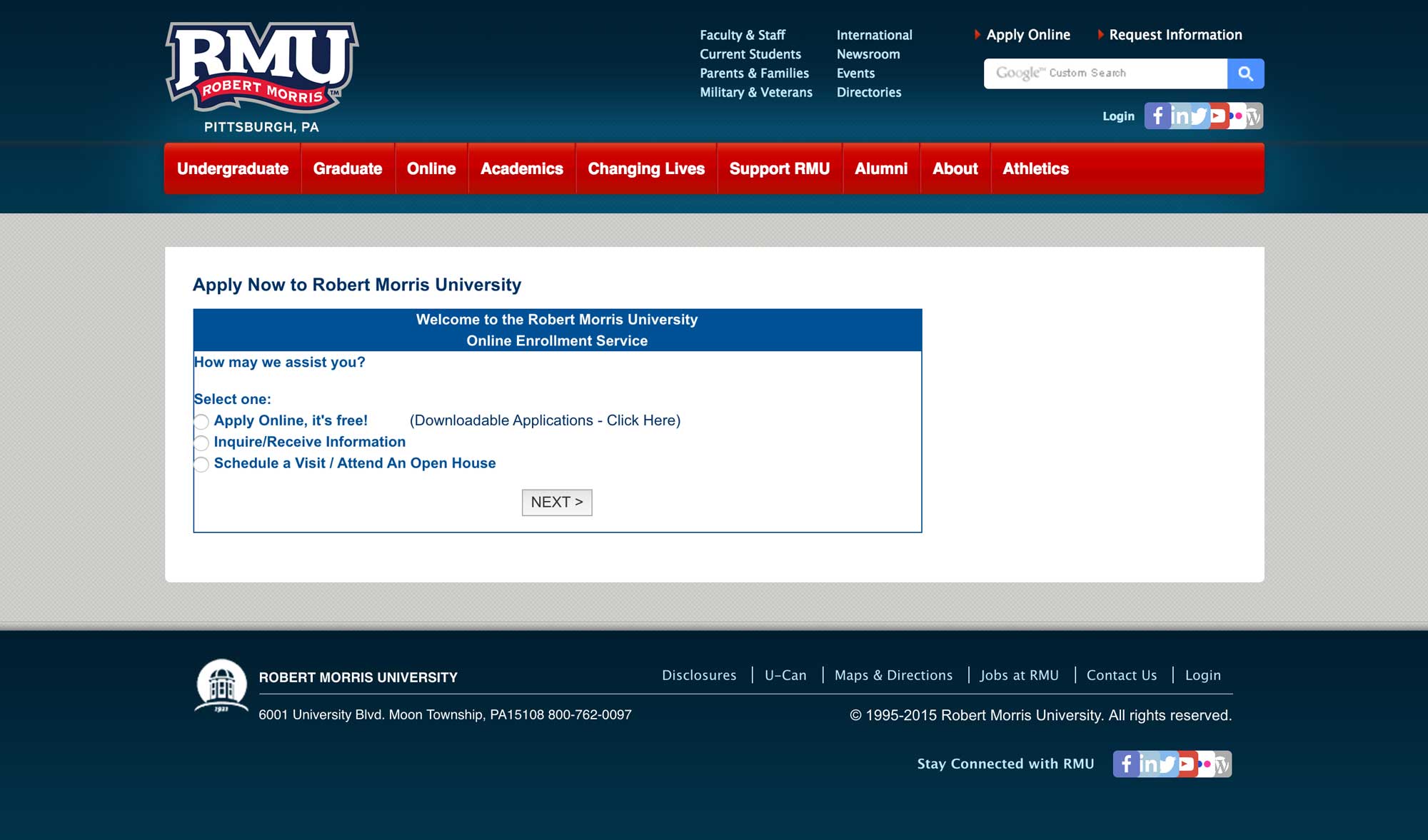
To put into perspective where this project began, refer to the screenshot below:

As you can see from the screenshot above, the old application was very simple, with no focus on design. The original design was not inviting, not accessible, and not responsive.
Creating the New Application
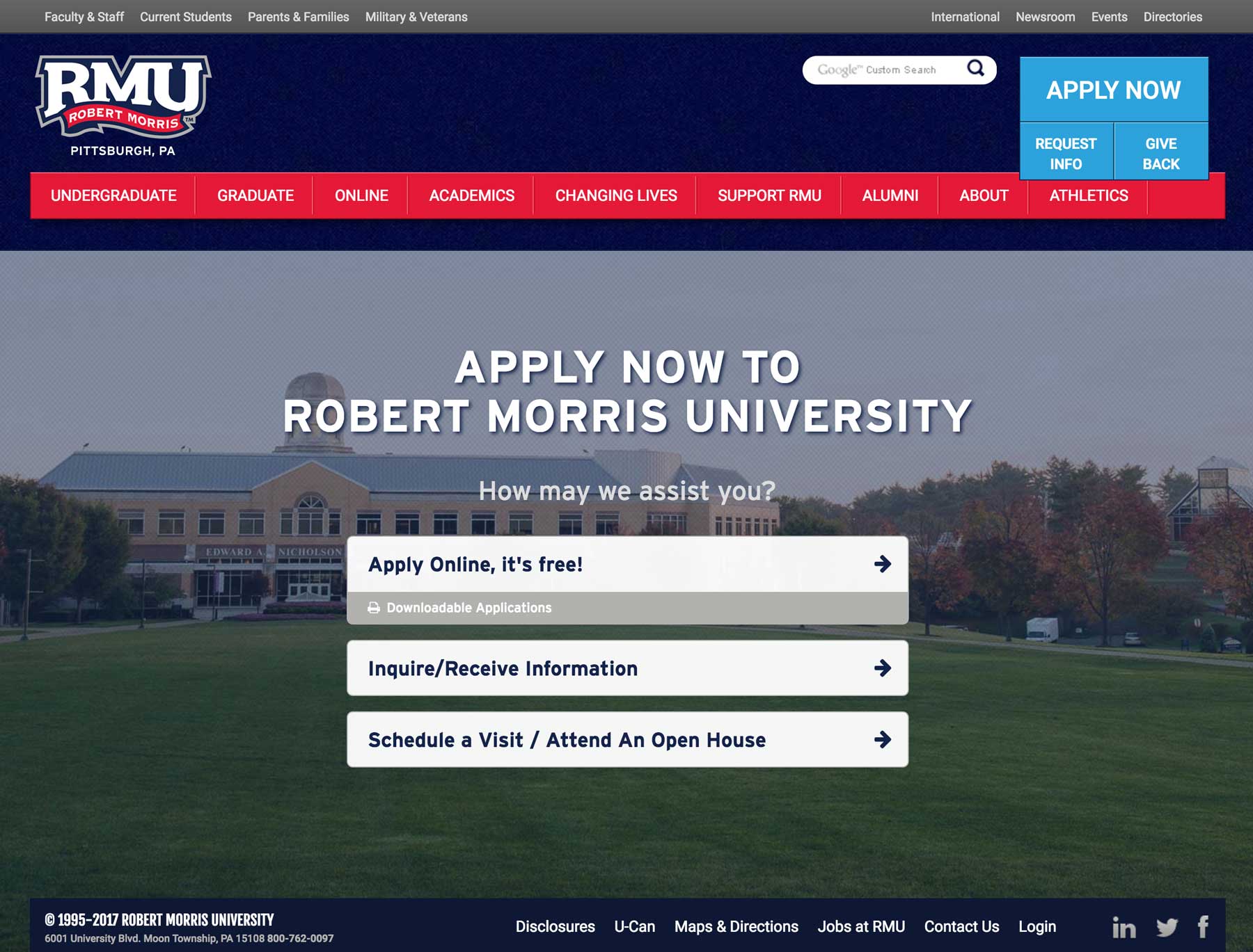
As I began the process of designing the updated application, I took some time to think about the purpose and intention. The particular page showcased above is the entry point to various applications (undergraduate, graduate, post-graduate, etc). It was important to provide an experience that was simple, welcoming, and friendly. The result came out to be a simple, mobile-first interface with repurposed calls to action and a focus on the overall brand.

The webpage uses subtle animations to indicate the flow between the various steps of needed to collect user data. Once the student has completed the initiate flow, it processes the students entry and forwards them to the correct application for their degree type.
Graduate Application
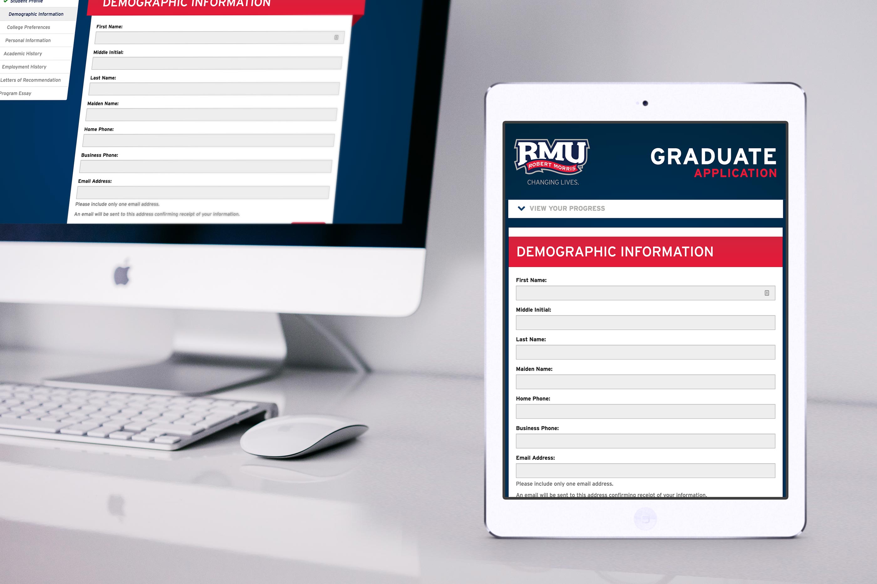
As I mentioned above, the user enters a specific application flow after their degree type is identified. One of these pathways is for graduate degrees. Prior to the application redesign, the graduate application contained a clutter of input fields in a desktop-only format. Users who attempted to apply via mobile devices were often discouraged and incompletion rate was rather high.
Without losing too much of the structure, I went forward with a mobile-first approached that focused on responsive input fields and a progress tracker. The goal of the progress tracker was not only to indicate which sections had been completed, but also to allow easy navigation throughout the various components of the application.
The end result was a simple, responsive, and intuitive interface that increased overall application rates.
